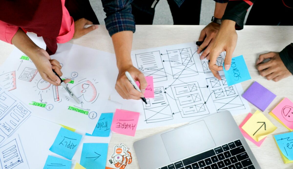
Readers of our blog will know that user research is important to the Digital Team. Around this time last year, I wrote about how we were going to approach user research in 2023 and that we were putting a renewed focus on using research to inform our decisions. Well, we’re now approaching the second half of 2024, so what research did we get done in the past 12 months? Did we put our money where our mouth is?
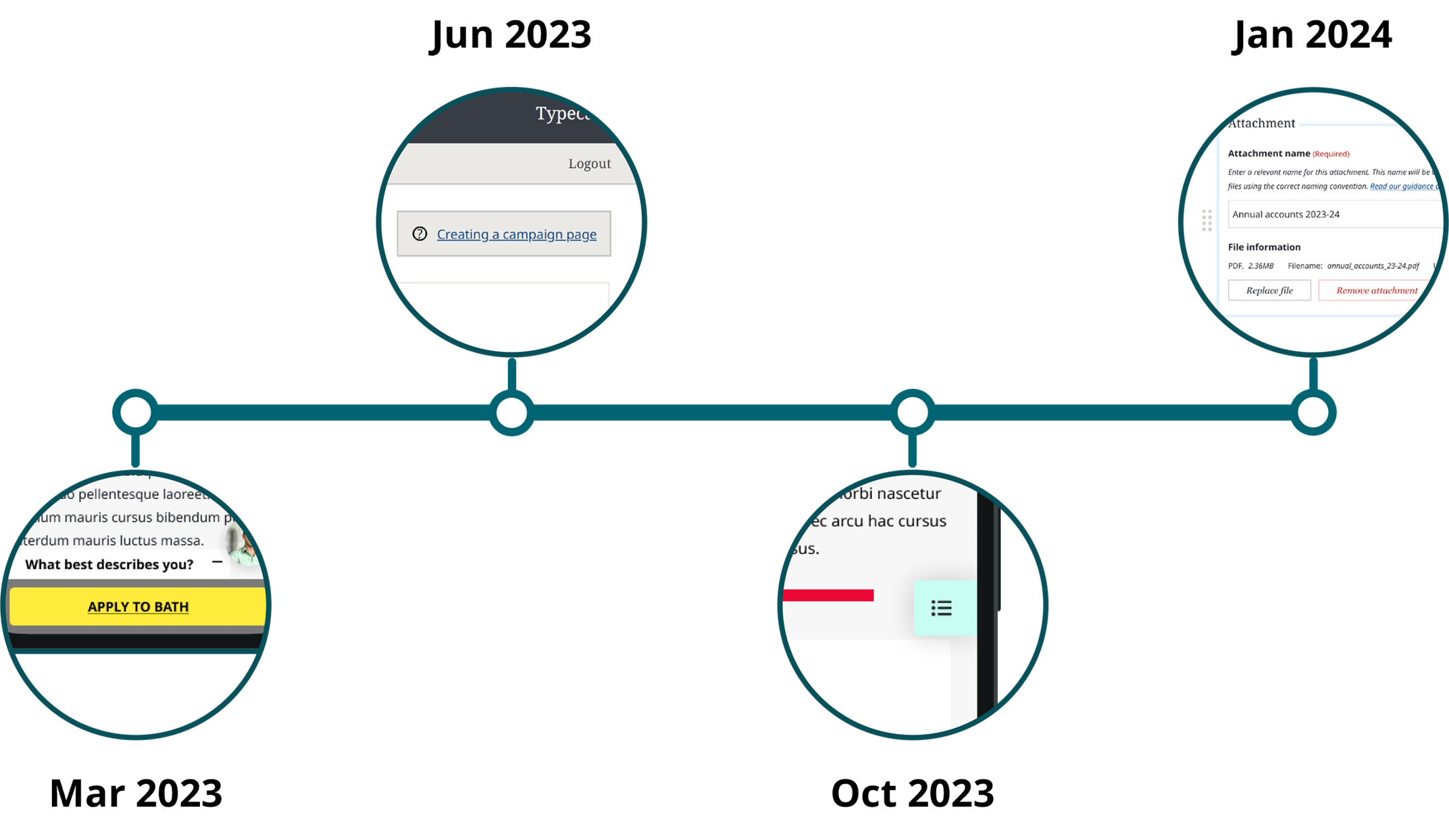
March 2023 - Persistent apply CTA
Back in the early part of last year we were approached by colleagues in the Marketing team who wanted to add a persistent link to our postgraduate course pages allowing users to apply to the course no matter where they were on the page. We had recently implemented a persistent in-page navigation on course pages – you can read about that in another blog post – so that seemed like an obvious place for it on the desktop version of the site.
However, it did not account for mobile devices. We hadn’t yet implemented a persistent navigation on mobile, and even if we had, it wouldn’t fulfil the requirements our colleagues had for a link or CTA that was always available to users. It was clear a different solution was needed. So, we came up with some design options and carried out some guerrilla-style A-B testing with students around campus. Most of the participants thought it was a useful feature and that it would make applying easier. However, a lot said it wouldn’t necessarily impact their decision on whether to apply to a course.
We’ve yet to move forward with a solution for this problem on mobile devices. Sometimes these things end up going on the backburner while other priorities get moved up.
June 2023 – Improved help links in Typecase
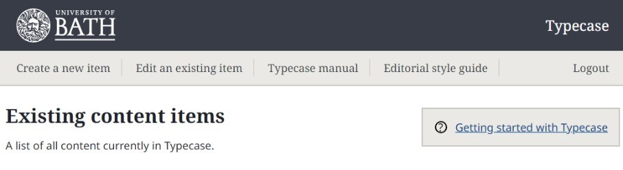
Our bespoke in-house CMS Typecase has been used by web editors across the University to create content on our website for some years. A while back, the Content team created the Typecase manual – a complete set of guidance on how to use Typecase and all its components. We embedded helpful links to specific pages in the manual throughout the Typecase interface. For example, when you add a call-to-action component to a page, you’ll see a link at the top of the component taking you to the relevant page in the manual where you can learn all about how to use the call-to-action component.
Users generally responded positively to these helpful links. However, these links are only available when you add these components to a page. The Content team wanted to include persistent links to the main landing page for the Typecase manual and our editorial style guide, making them always available to users. We could have just put two simple links at the top of each Typecase page and left it that. However, we thought it was another opportunity to test some other possibilities to see if we could do better.
We tested a variety of different configurations using a method somewhere between a traditional A-B test and a usability study. We eventually settled on adding two permanent links for the Typecase manual and editorial style guide to the top navigation, as well as a styled contextual link which sits at the top of new content pages and takes users to the guide page for content types.
Typecase users can see these changes for themselves right now.
October 2023 – Persistent in-page nav on mobile
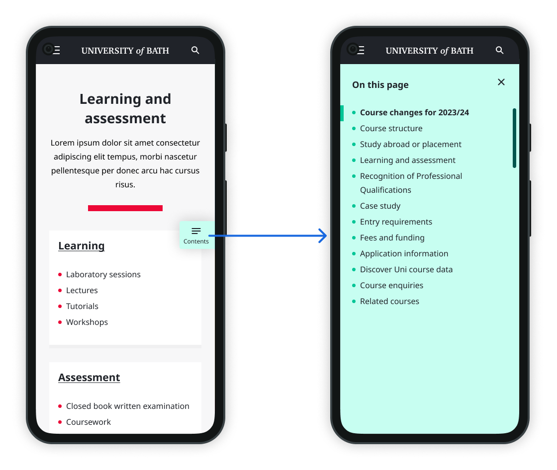
As I mentioned earlier on in this blog post, we had rolled out a new in-page navigation on desktop in early 2023. We feel it immediately improved the user experience, particularly on our course pages. However, we’d only implemented it on desktop and we knew we had to address mobile users, so we set about designing a solution fit for mobile devices pretty soon after.
As usual, we had a variety of design options, and while some were obviously better than others, we didn’t know which one users would respond to best. More user research was the order of the day.
We picked what we felt were the three best design options and devised a usability study where we went out onto campus and recruited participants guerilla style. We randomly assigned them one of the three designs and then asked them to carry out a series of tasks, measuring how they performed, observing how they used the prototype and listening to their feedback.
We learned a lot from this study. Firstly, only 50% of the 40 participants realised they could use the new navigation – indicating a potential discoverability problem. Secondly, those who did use it completed their tasks more quickly and made fewer errors than those who didn’t. This told us that a persistent in-page navigation makes navigating these pages easier, regardless of which design option we went with.
We used the insights from this study to move forward and we implemented the new navigation shortly afterwards. You can see it for yourself if you browse one of our course pages on a mobile device. We also planned a follow-up study to look at whether our choice of iconography or labelling affected how likely users are to use the navigation.
Jan and May 2024 – New UX for publications
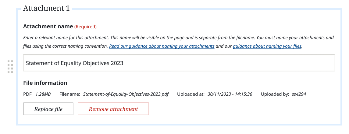
Our next content type in our ongoing work to transition away from our old-style pages to the modern Lens-style ones (Lensifying, if you will) is publications. Publication pages host attachments for published documents on the website - things like PDFs of policies or important reports. We try to encourage people to use web pages for content wherever possible, but sometimes there is no substitute for a document. This content type has perhaps the biggest opportunity for improvement in user experience on Typecase - saying that it’s not well-liked would be putting it charitably. Because their sole purpose is to host attachments, you would think that the experience of uploading said attachments is easy and intuitive. It is not...
Our new designs are aiming to make a host of improvements to the user experience, but the most important things include allowing users to easily reorder and rename attachments on their pages and make the pages able to handle uploading multiple attachments at the same time, rather than having to save the page between each attachment – as is the case with the current experience.
In January we conducted an initial usability study with a select group of Typecase users to see how they responded to some of the changes we proposed. Most of the changes, especially those relating to the file upload experience, were well received. However, the study did reveal some pain points that we hadn’t fully considered. We used this feedback to make further refinements which we then tested again in a follow-up usability study that we conducted in May of this year.
Our developers are now implementing the new publications experience as I write this!
What’s next?
So that brings us up to do date. We feel in the last 12 months we’ve successfully refocused on prioritising user research, and it’s really helped us in our decision-making process.
Later in the year we will be working on a new home page – something I’m sure any fellow web designers will recognise is a daunting task! As you can imagine, this will involve a good deal of user research to make sure we get it right, not only with the page itself, but also the many changes we’ll be making to how Typecase will work with the new home page.
Watch this space...
Respond